Contents
|
|
|
|
|
|
|
|
|
|
|
|
|
|
|
|
|
|
[ ] |
|
|
|
|
About Pivot Chart:
The following chapter explains the settings, that can be set in Pivot Chart.

Figure 1 - Ribbon bar
Button |
Example |
Description |
|||
|
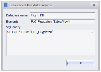
Figure 2 - data source |
Clicking the icon data source opens a window (see figure 2), where informations about the connected data source is displayed. Database name contains the name of the database, connected to SimAssist. Element contains the name and typ of the connected element. Possible typs are table, query or a SimAssist-query. The SQL query field displays the SQL query, the result of which serves as the data source for the particular plug-in. |
|||
|
A Click on the Disconnect Icon disconnects the data source. The data is no longer available in the plug-in. |
||||
|
Opens the Chart Designer in a new window. A detailed description can be found in the chapter Chart Designer. |
||||
|
Opens a drop down for loading and saving templates. A detailed description can be found in the chapter Templates. |
||||
|
Opens a dialog for creating and managing color schemes. A detailed description can be found in the chapter Colors. |
||||
|
|
Opens a dialog where settings of the plug-in can be read and easily transfered to other plug-ins. Also a customized sorting can be set here. Details can be found in chapter Transfer settings and custom sorting |
|||
|
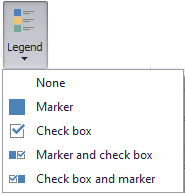
Opens a drop down menu where you can choose between different view options for the legend. •No legend in the chart •Standard legend in the chart •Legend with check boxes in the chart •Marker and check box in the chart •check box and marker in the chart |
||||
|
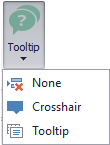
Opens a drop down menu where you can choose between different tooltips for the Chart. •No tooltip in the diagram •Crosshair: DevExpress standard tooltip in the Chart (Can be parameterized via the Chart Designer) •Tooltip: Windows standard tooltip in the Chart (cannot be parameterized via the ChartDesigner) |
||||
|
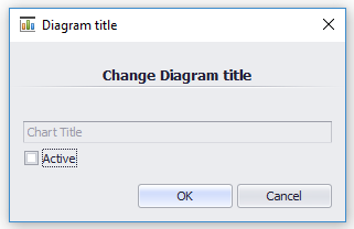
Figure 3 - Diagram title |
Use the Diagram title button to assign a title to the chart. A window opens in which you can activate the title by setting a check mark in Active (see Figure 3). The field is now available to enter an individual title. When you click OK, the title of the chart you just created appears in the working area. |
|||
|
Figure 4 - Bar Diagramm Labels |
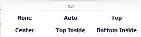
Opens a drop down menu and allows setting the labels of the chart elements (such as bars). The selection of the label types depends on the type of the currently used diagram. |
|||
|
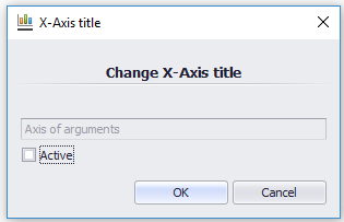
Figure 5 - Change X-Axis title |
Use the X-Axis-Title button to assign a title for the X-Axis. A window opens in which you can activate the title by setting a check mark for Active (see Figure 5). The field is now available to enter an individual title. After clicking OK, the title you just added appears next to the X-Axis in the working area. |
|||
|
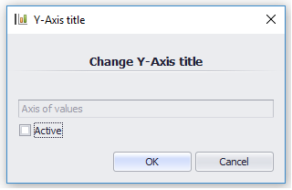
Figure 6 - Change Y-Axis title |
Use the Y-Axis-Title button to assign a title for the Y-Axis. A window opens in which you can activate the title by setting a check mark for Active (see Figure 6). The field is now available to enter an individual title. After clicking OK, the title you just added appears next to the Y-Axis in the working area. |
|||
|
Enables / disables the display of the scale on the X-Axis in the working area. |
||||
|
Enables / disables the display of the scale on the Y-Axis in the working area. |
||||
|
Enables / disables zooming on the X-Axis. |
||||
|
Enables / disables zooming on the Y-Axis. |
||||
|
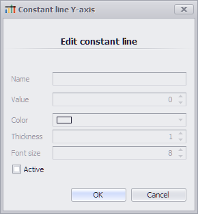
|
Opens a dialog where a constant Y-Line can be added |
|||
|
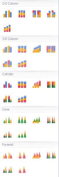
Figure 5 - Column diagrams |
Opens a drop down menu where you can select different types of column diagrams. You can choose (from top left): •Clustered Column •100% Stacked Column •Clustered 100% Stacked Column •Clustered Stacked Column •Stacked Column
•3D Clustered Column •100% Stacked Column in 3D •3D Column •Clustered 100% Stacked Column in 3D •Clustered Stacked Column in 3D •Stacked Column in 3D
•Clustered Cylinder •100% Stacked Cylinder •3D Cylinder •Clustered 100% Stacked Cylinder •Clustered Stacked Cylinder •Stacked Cylinder
•Clustered Cone •100% Stacked Cone •3D Cone •Clustered 100% Stacked Cone •Clustered Stacked Cone •Stacked Cone
•Clustered Pyramid •100% Stacked Pyramid •3D Pyramid •Clustered 100% Stacked Pyramid •Clustered Stacked Pyramid •Stacked Pyramid |
|||
|
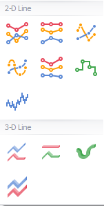
Figure 6 - Line diagrams |
Opens a drop down menu where you can select different types of line diagrams. You can choose (from top left): •Line •100% Stacked Line •Scatter Line •Spline •Stacked Line •Step Line
•3D Line •100% Stacked Line in 3D •3D Spline •Stacked Line in 3D •Step Line in 3D |
|||
|
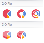
Figure 7 - Pie diagrams |
Opens a drop down menu where you can select different types of pie diagrams. You can choose (from top left): •Pie •Doughnut •Nested Doughnut
•Pie in 3D •Doughnut in 3D |
|||
|
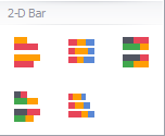
Figure 8 - Bar diagrams |
Opens a drop down menu where you can select different types of bar diagrams. You can choose (from top left): •Bar •100% Stacked Bar •Clustered 100% Stacked Bar
•Clustered Stacked Bar •Stacked Bar |
|||
|
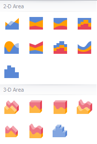
Figure 9 - Area diagrams |
Opens a drop down menu where you can select different types of area diagrams. You can choose (from top left): •Area •100% Stacked Area •100% Stacked Spline Area •100% Stacked Step Area •Spline Area •Stacked Area •Stacked Step Area •Stacked Spline Area •Step Area
•3D Area •100% Stacked Area in 3D •100% Stacked Spline Area in 3D •Spline Area in 3D •Stacked Area in 3D •Stacked Spline Area in 3D •Step Area in 3D |
|||
|
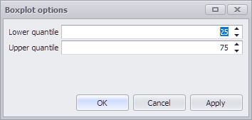
|
Opens a drop down menu where you can select "other" types of area diagrams. You can choose (from top left): •Boxplot If a boxplot diagram is created, the calculated data can subsequently be used via the data provider interface. Details on the data provider interface can be found in the Data provider interface section in the Project data chapter. The respective quantiles of the boxplot can also be adjusted via the options. |
|||
|
By clicking the button Orientation you can switch between different views of chart and pivot in the working area. A detailed description can be found in the chapter Orientation. |
||||
|
The Pivot Fields button can be used to display or hide these in the data area. A detailed description can be found in the chapter Pivot Fields. |
||||
|
Opens a drop down menu where you can choose between various export options. A detailed description can be found in the chapter Export Chart. |
||||
|
The Export pivot button can be used to export the existing pivot table as an image. A detailed description can be found in the Chapter Export Pivot. |


© SimPlan AG - Hanau District Court, Commercial Register (Part B) 6845 - info@simplan.de - www.simplan.de/en