The following comprises instructions for the ABC Analysis plug-in, as well as an example use case to provide more detailed step-by-step instructions.
Contents
1. Introduction to the plug-in
1.3 Position in the Overall Software Package
3.2 Setting categories and parameter
1. Introduction to the plug-in
With the plug-in ABC Analysis, ABC analysis based on the Pareto principle can be performed and evaluated.
This principle, also known as the Pareto effect or 80/20 rule, describes the statistical phenomenon that a small proportion of values contributes significantly more to the total than the rest.
The aim of ABC analysis is to divide the objects to be examined into categories in order to make statements about them.
Class A represents a particularly high value, where the objects usually have a small proportion of the quantity but a particularly high proportion of the total value.
Class B contains the quantity of objects with a medium value share and class C contains the quantity of objects with a very low value share.
The diagram can be created by distributing the columns from the connected database to the pivot fields. In addition to the three standard categories or classes, any number of other classes can be added.
The results of the analysis can be presented and evaluated with the help of the plug-in in four different display modes.
1.3 Position in the Overall Software Package
The ABC Analysis plug-in is part of the 2analyze module, which also contains the Categorization, Confidence Interval, Distribution fitting and Correlation Matrix plug-ins.
ABC Analysis is available when you license the 2analyze module for SimAssist.
The ABC Analysis plug-in has links to a total of four other plug-ins. First, there is a connection to the Database Definition plug-in, which acts as a data source and thus provides the data pool to be calculated for analysis.
Using the SQL Expressions plug-in, the data pool can be specified individually using SQL queries. It is possible to export the diagram into a reporting document and integrate it into the project documentation.
The diagram can also be exported to a PowerPoint presentation using the PowerPoint plug-in.
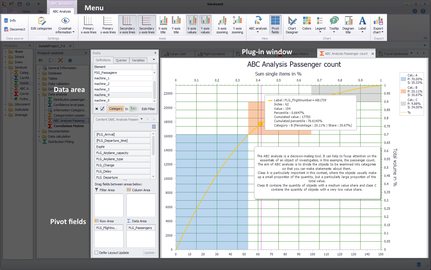
Figure 1 - Overview
The ABC Analysis plug-in consists of three different sections. First of all, the plug-in menu is displayed at the top edge, where various settings can be made.
Below it on the left side is the data area, where the Pivot table and the Pivot fields are located. Here you can add the data that will be used as the basis for the calculation to the plug-in.
For more detailed information, please refer to the chapter Pivot Fields.
The content area (plug-in window) takes up the largest part of the plug-in. Here, the results of the calculation are displayed in graphical form.
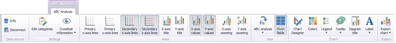
Figure 2 - Menu
The following table lists all plug-in relevant buttons and explains their function:
Button |
Example |
Description |
|
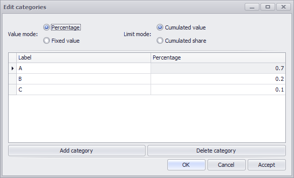
Figure 3 - Edit categories
Figure 4 - Edit categories |
The button Edit Categories opens a dialog where the properties and the calculation method of the categories can be parametrized. In the dialog categories can be added and deleted and their names can be determined. Their ranking results from the sorting in the list. In the example of Figure 3, category A is before B and category B before C. In case the actual limit of the last category, here C, is not at 100% of the total value, an artificial category Rest is added when calculating the ABC analysis. This has a fixed value of 100% and is intended to ensure that all items are included in the analysis. The type of value limit of the categories for the analysis can be defined by two parameters: The value mode and the limit mode. These two modes are explained below. The Value Mode parameter determines how the limit is calculated. There are two different modes available for this purpose, which are explained below. •Mode 1: Percentage In this mode, the limits of a category are set according to the percentage of the total value. Note that the actual limit is the cumulative percentage of the previous categories plus the own value. In the example in Figure 3, the category limits are 70% for A, 90% for B and 100% for C. An item is in the respective category if its cumulative percentage share is between the limit of the previous, or 0% for the first, and its own cumulative share. This mode is set as standard, since this type of limit definition is the normal case.
•Mode 2: Fixed value In the second mode the limit of a category is defined by a fixed value. Here, too, the actual limit is calculated from the cumulative values of the previous values, plus your own value. The value 0 is a special feature here. If this value is fixed for a category, the category becomes infinite and therefore includes all remaining items. Thus, in the example in Figure 4, the category limits are calculated as follows: •Category A is defined in the range from 0 to 10,000 •Category B in the range 10,000 to 40,000 •Category C in the range from 40,000 to infinite This can be used, for example, in the last entry if you do not know the total value. Otherwise, the remaining category would also intervene here in an emergency. An item belongs to a category if its cumulative value is within the cumulative threshold value of the previous category, or 0 in the case of the first category, and its own cumulative threshold value. This mode is more a special case of ABC analysis, in which you want to examine how many items correspond to a certain actual value.
Limit Mode The Limit Mode parameter determines along which axis the limit is set. There are also two modes, respectively the X and y axis. •Mode 1: Cumulative value If the limitation mode is set to the cumulative value, the category limits are on the y-axis.
•Mode 2: Cumulative share If the limitation mode is set to the cumulative share, the category limits are on the x-axis.
When the categories have been defined and the desired type of limits has been set, this can be confirmed by clicking OK. The parameters are then applied to the model and the analysis is restarted if data is already available. |
|
|
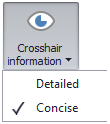
The Crosshair Information button defines the display mode of the information on aggregated points in the crosshair (tooltip) if the data volume exceeds 100,000 points. You can choose between Detailed and Concise. |
|
|
The Primary x-axis lines button shows or hides the lines for the primary X-axis |
|
|
The button Primary y-axis lines shows or hides the lines for the primary Y-axis |
|
|
The button Secondary x-axis lines shows or hides the lines for the secondary X-axis |
|
|
The button Secondary y-axis lines shows or hides the lines for the secondary Y-axis |
|
|
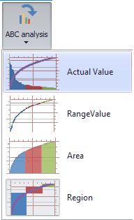
With the button ABC Analysis you can choose between four display modes, which are explained in the following
Actual Value The first option represents the classic Pareto chart, where each item, with value, is entered as a bar. In addition, the cumulative percentage of the total volume is added in the form of a line. This option has the advantage that the value of each item can be read directly from the primary Y-axis. At the same time, it is easy to see the range of values covered by the respective categories. The change in the percentage share can be followed exactly thanks to the cumulated line.
Range Value Alternatively, the display with range bars is available for selection. In this case, the Y-value of each bar begins at the end value of the predecessor and ends at the sum of the end value of the predecessor and the own value. With this type of display, the jumps resulting from the value of the individual items are clearly visible. Accordingly, the percentage share they contribute to the total value is also easy to read, since this is implicitly displayed in the bar as information.
Area The third form of representation is the area diagram. This is the simplest form of representation, in which each position is drawn as an area from zero to its own value. The area diagram thus offers a quite simple but quick overview of the collected data.
Region The fourth and last option is the Regions Chart. Here, the cumulative percentage shares are entered as a line. On the other hand, the calculated values for share and volume of the individual categories (A, B, C, ...) are drawn in. This type of display allows a quick assignment of the individual categories. It is also easy to see what proportion each category contributes to the overall result, and the scope of these. |


In the Options in the main menu of SimAssist you can make plug-in specific settings (see chapter Options). The following options are available for the ABC Analysis plug-in:
Option |
Description |
ABC Analysis |
|
Maximum limit of data points in the chart |
Specifies the maximum number of individual points that can be drawn in the chart. If the number is exceeded, points are aggregated. Increasing this parameter can negatively affect performance of the chart. |
Diagram |
|
Show end value |
Specifies the default value whether the end value of an interval is shown or not. This is applied when a new plugin-in instance is created. |
X-axis zooming |
Specifies the default value whether zooming is allowed for the diagram's panes along their X-axes. This is applied when a new plugin-in instance is created. |
Y-axis zooming |
Specifies the default value whether zooming is allowed for the diagram's panes along their Y-axes. This is applied when a new plugin-in instance is created. |
Grouping |
|
Complement intervals |
Specifies whether missing intervals are complemented. |
Interval type |
Determines how numeric values or dates are assigned to a range. |
Maximum interval count |
Defines the maximum interval count that can be created by the grouping. |
Substring mode |
Sets the direction of the substring operation when grouping alphanumeric values. |
To work with the plug-in, a data source must first be connected to the plug-in and then the desired columns must be distributed to the pivot fields (see Figure 5).
There are four pivot fields in total, but only three of them are activated and can be used for ABC analysis.
Filter Area
Fields that are dragged into the filter area are used to filter the data. Any number of fields can be inserted in this area.
The filter area is an optional area. This means that fields do not necessarily have to exist here for an analysis to be calculated.
This enables a very varied ABC analysis, since not only the total quantity can be analyzed, but also analysis filtered according to specific requirements.
Row area
The fields located in the row area group the data according to the values of the respective columns. Here, too, you can add as many fields as you like to make the groupings even more detailed.
However, at least one field in this area is required for an analysis to be created.
Data area
The data range determines the column from which the value for the basis of the ABC analysis comes. Only one field can be filled here, since this must be unique.
However, it is also necessary to define a field in this area so that the analysis is executed.
Column area
The column area is deactivated in the ABC Analysis plug-in and does not accept fields, as it is not intended for this purpose.
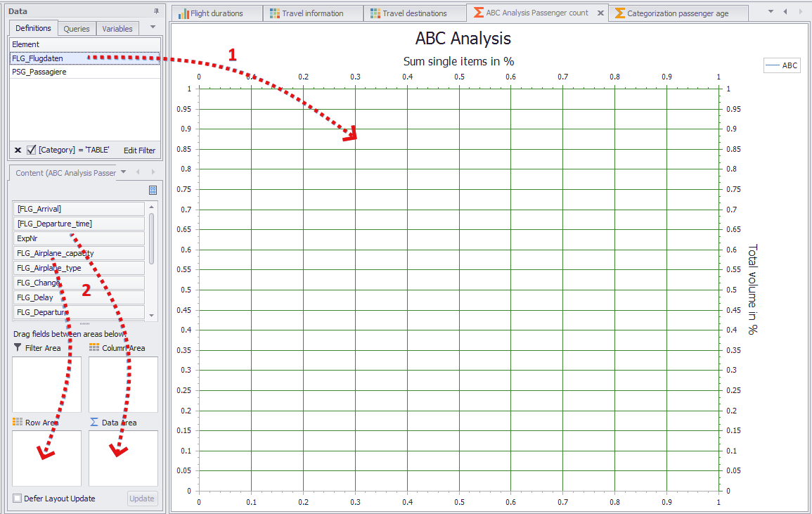
Figure 5 - Adding data
3.2 Setting categories and parameter
The next step is to define the categories and parameters for the calculation of the ABC analysis. For this purpose the button Edit Categories must be clicked.
Thereupon the dialog shown in Figure 4 opens, in which the properties and the calculation type of the categories can be changed. For a detailed description see section Menu.
Once all the necessary columns have been distributed to the pivot fields, the data can be viewed in the diagram by moving the mouse over the individual points.
A label is displayed next to the crosshairs, which contains the most important information for each point. In addition, it is possible to change the zoom of the diagram in order to have a closer look at a certain section.
In figure 6, for example, a smaller section is viewed while the information of a certain point is displayed.
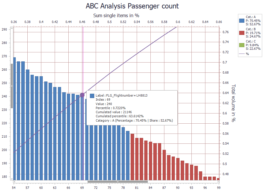
Figure 6 - Tooltip and zoom
The results of the calculation are made available as a table via the data provider interface. This data can then be used in SimAssist as usual.
Details on the data provider interface can be found in the Project data chapter in the Data provider interface section.
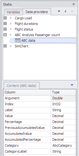
Figure 7 - Data provider interface
The export of the calculated data can be done via the Reporting plug-in as well as via the PowerPoint plug-in. For information on how to proceed for the export, please refer to the corresponding chapters.
© SimPlan AG - Hanau District Court, Commercial Register (Part B) 6845 - info@simplan.de - www.simplan.de/en