The following comprises instructions for the Categorization plug-in, as well as an example use case to provide more detailed step-by-step instructions.
Contents
1. Introduction to the plug-in
1.3 Position in the Overall Software Package
1. Introduction to the plug-in
The Categorization plug-in enables you to divide data into quantile-based categories or fixed-length categories.
You can use the Categorization plug-in to divide a self-compiled data pool of numerical values into categories. The following categorization types are available:
•Intervals count
•Intervals length
•Quantile
You have the option here of defining settings, such as the number of categories and length of intervals, and also, where the length of intervals is calculated, of specifying a minimum and maximum value.
Once the calculation is complete, the intervals calculated are displayed and accordingly visualized in the form of a chart.
1.3. Position in the Overall Software Package
The Categorization plug-in is part of the 2analyze module, which also contains the Confidence Interval, Distribution Fitting, ABC Analysis and Correlation Matrix plug-ins.
Categorization is available when you license the 2analyze module for SimAssist.
The Categorization plug-in is linked to a total of three other plug-ins.
The first plug-in it is linked to is the Database Definition plug-in, which acts as a data source, and therefore provides the data pool to be calculated for the categorization.
With the SQL Statements plug-in, the data pool can be individually specified using SQL queries; this is also possible with the Variables plug-in.
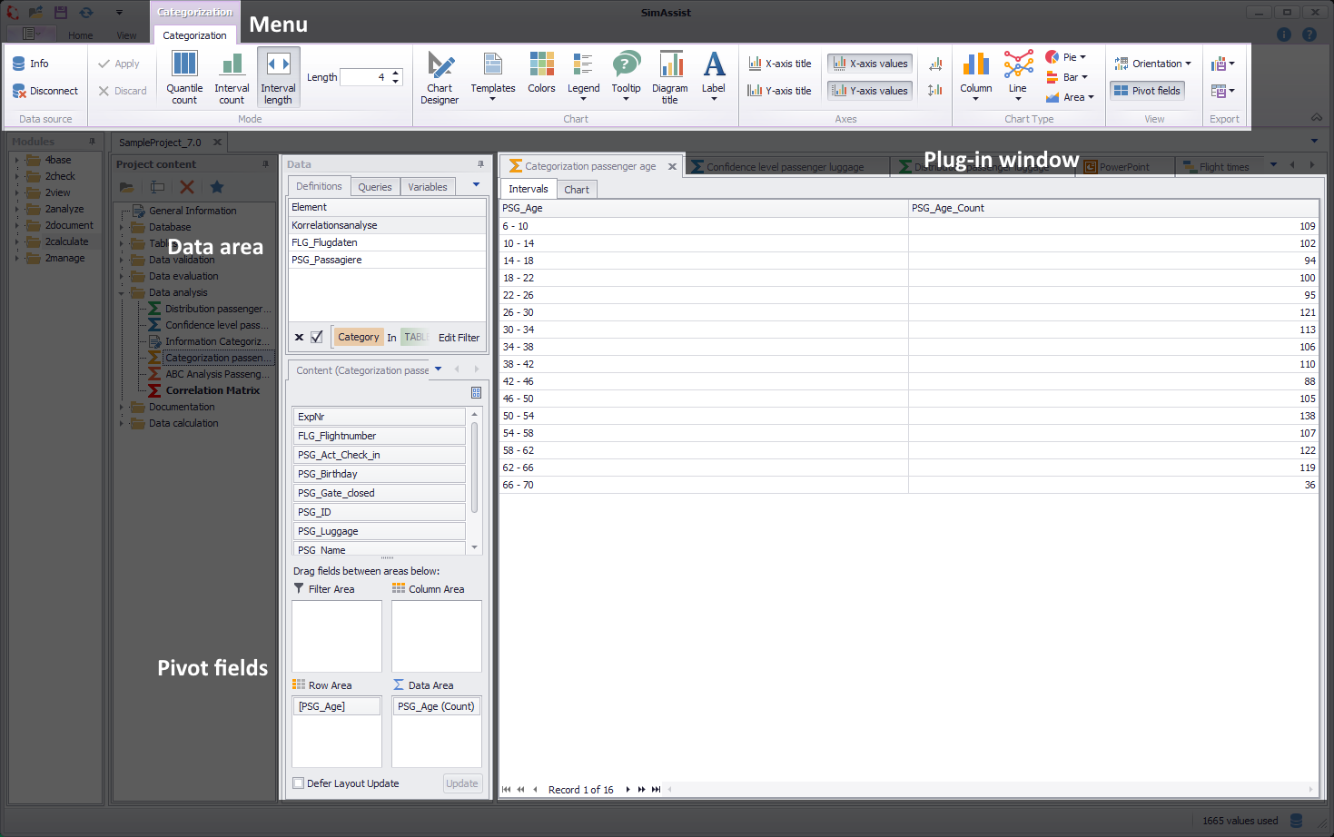
Figure 1 - Layout of the Categorization plug-in
The Categorization plug-in is divided into three main areas. First, at the top of the plug-in window, is the menu. The available buttons are grouped in the categories data source, Mode, View, Chart, Chart Type, Axes and Pivot.
The Plug-in Menu, which is integrated into the Main-Menu is displayed, when a new instance of the plug-in is added to the project content area.
The Data Area is filled with data from the connected data source. Below, the Pivot Fields are displayed.
For further information about the Pivot Fields, check the chapter Pivot Fields.
The buttons from the categories data source, View, Chart, Chart Type, Axes and Pivot are available permanently. For more information about those buttons, check the chapter Pivot Chart.
The largest area of the plug-in window is taken up by the interval /chart area. Following calculation, the categorization intervals and associated visualization are displayed here in the form of a chart.
The Categorization plug-in menu is embedded into the frame application menu and varies depending on the categorization type selected (intervals count, intervals length or quantile).
Quantile Count / Interval Count
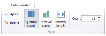
Figure 2 - Quantile Count / Interval Count
For the categorization types Quantile Count and Interval Count, you can specify the number of categories into which you want to divide the data pool values (see Figure 2).
In the Count field, you can either enter a numerical value manually or use the arrow icons to configure the desired number of categories.
Intervals Length
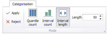
Figure 3 - Interval Length
For the categorization type intervals length, you can specify the length of the intervals.
Here too, you can either enter a numerical value manually in the relevant field or use the arrow icons to configure the desired length (see Figure 3).
In this mode (starting with SimAssist version 10.1), the grouping function is active in the pivot fields. This allows you, for example, to set interval boundaries as desired.
In the Options in the main menu of SimAssist you can make plug-in specific settings (see chapter Options). The following options are available for the Categorization plug-in:
Option |
Description |
Diagram |
|
Show end value |
Specifies the default value whether the end value of an interval is shown or not. This is applied when a new plugin-in instance is created. |
X-axis zooming |
Specifies the default value whether zooming is allowed for the diagram's panes along their X-axes. This is applied when a new plugin-in instance is created. |
Y-axis zooming |
Specifies the default value whether zooming is allowed for the diagram's panes along their Y-axes. This is applied when a new plugin-in instance is created. |
Grouping |
|
Complement intervals |
Specifies whether missing intervals are complemented. |
Interval type |
Determines how numeric values or dates are assigned to a range. |
Maximum interval count |
Defines the maximum interval count that can be created by the grouping. |
Substring mode |
Sets the direction of the substring operation when grouping alphanumeric values. |
PivotChart |
|
Orientation |
Specifies the default orientation for new diagrams. This is applied when a new plug-in instance is created. |
Templates |
|
Default template |
This template is applied once when creating a new instance. |
As the Categorization plug-in is used for calculation purposes for a data clustering, only numerical values can be added in the Data Source area.
To add data to the Categorization plug-in, move the desired data representations, such as a table column, from the data area in the project window to the Row Area of the Pivot Fields.
If a new column is added to the Row Area, the old value is overwritten automatically.
1.The first step when using the plug-in is to add data to the plug-in. Drag the desired data representation into the plug-in window.
2.Then choose the desired categorization type. You can choose to calculate the intervals count, the intervals length or the quantile.
3.Now you can define the count - in the case of Interval Length the length - and fit the calculation to your own requirements.
4.The calculation starts automatically as a value / a column is added to the plug-in window / the row area.
5.If changes are made, the calculation can be updated via the Apply button (see figure 2/3).
Once the categorization has been calculated, the intervals and associated chart are displayed in the plug-in window area. You can use the tab bar at the top of the display to switch between the two displays (see figures 4 and 5).
The created diagrams can be configured individually with the help of the Chart-Designer (see figure 1). Detailed information about the Chart-Designer can be found in the chapter Pivot Chart.
Figure 4 - Intervals |
Figure 5 - Chart |
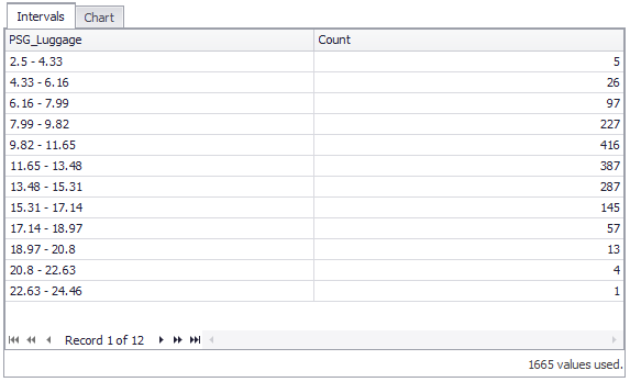
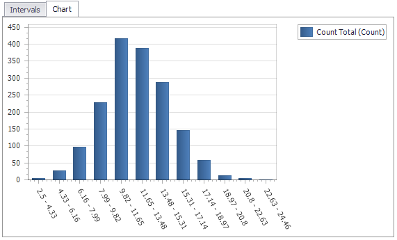
At the bottom of the intervals display, the number of values used for the calculation of the categorization is displayed.
The following comprises a detailed use case that aims to provide, by way of an example, an understanding of the functionality and use of the plug-in.
Step 1
At first a data source has to be added to the plug-in. To do so, drag a database entry into the plug-in window, or choose a single column.
If a database entry is selected, the containing columns show up in the content area of the pivot grid.
In this variant, the first column with a numeric value (in this case FLG_Passengers) is put into the Row Area of the Pivot Area (see figure 6).
If only a single column is dragged into the plug-in window, the content area of the pivot table is filled with only that column, that has to be set to the Row Area in order to start the evaluation.

Figure 6 - Adding Data to the plug-in
Step 2
After adding data to the plug-in, the categorization type can be set in the menu. You can choose between Quantile Count, Interval Count and Interval Length.
A click on Apply updates the calculation and the diagrams (see figure 7).
Figure 7 - Plug-in menu
Step 3
If you want to categorize another column of the data source, just drag the desired column out of the pivot-table into the Row Area.
The calculation is done automatically with the given options (see figure 8).
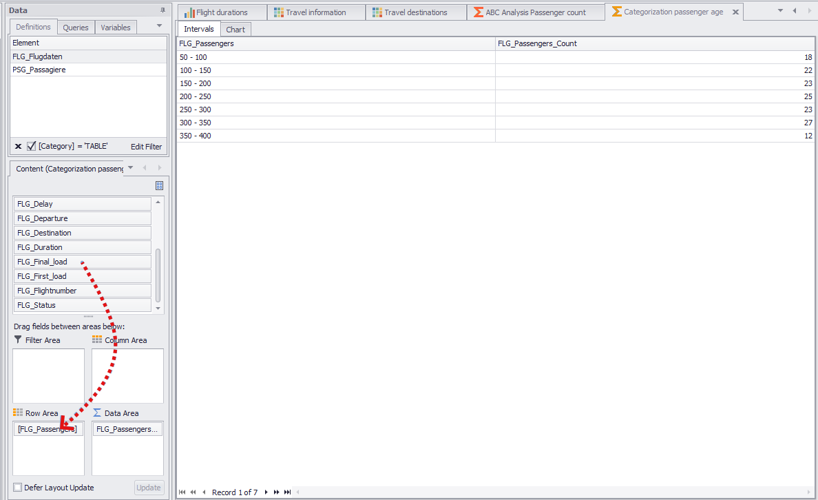
Figure 8 - Adding new data to the plug-in
© SimPlan AG - Hanau District Court, Commercial Register (Part B) 6845 - info@simplan.de - www.simplan.de/en