The following comprises instructions for the Table plug-in, as well as an example use case to provide more detailed step-by-step instructions.
Contents
1. Introduction to the plug-in
1.3 Position in the Overall Software Package
2.3 Information and Interaction Bar
1. Introduction to the plug-in
The Table plug-in enables you to display in tabular form, in accordance with individual rules, data from databases and to edit this data.
Furthermore you can export the data in the table to an external CSV file.
With the Table plug-in, you can display data from databases as well as queries, whereby you can add to the plug-in both entire databases and individual tables, or display your SQL queries.
By selecting multiple data sources, you can also display several tables at the same time. In addition to simply displaying content, the Table plug-in also offers an edit function.
This means that you can change the values of individual records. SimAssist checks here whether the new values match the right data type for the relevant table and informs you if a given value does not match.
1.3 Position in the Overall Software Package
The Table plug-in is part of the 4base module, which also contains the Database Definition and Vertical Table plug-ins.
As it is assigned to the 4base module, the Table plug-in is available as a basic feature in every SimAssist license package.
As the Table plug-in is responsible for displaying and directly editing data, it is linked to all plug-ins that may also be involved in the data query process.
These include:
•The Database Definition plug-in, responsible for the connection to databases
•The SQL Statements plug-in, which can be used to create SQL queries
•The Variables plug-in, which can be used to create variables to specify queries in more detail, for example.
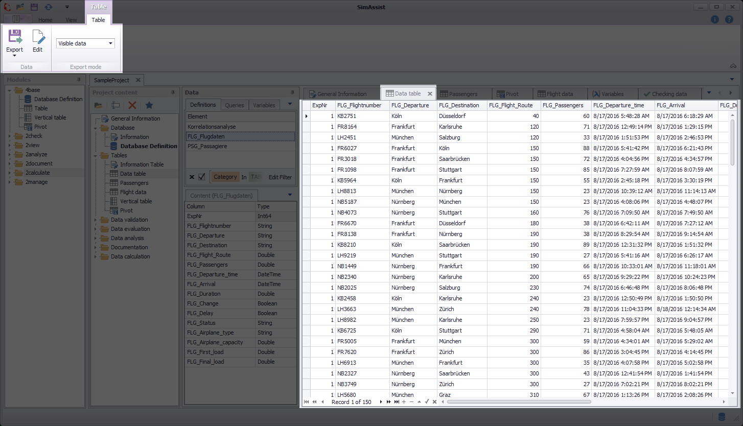
Figure 1 - Layout of the Table plug-in
At the top of the plug-in, you can see the Plug-in Menu. Directly below this is the table view area, in which the table content is presented. The information and interaction bar is located below this.
You can use this toolbar not only to control how content is displayed and edited, but also to view the information about the current record number and the total number of records.
The final area specifies the internal SQL query used to upload data to the Table plug-in from the relevant database. This area also specifies the title of the database in question.
|
Information The table data can be edited only where a primary key is available in the underlying database table that exists only in one column. |
The Table plug-in menu and corresponding interaction bar contain the functions required to display and edit database content. The menu’s individual interaction options are presented below.
Button |
Description |
|
When you choose Export, you can export the table's data into an external CSV file. Details on Export can be found in chapter How to Export. |
|
When you choose Edit, you enable edit mode, which, in turn, enables two additional interaction elements in the menu (Commit and Discard). |
|
When you choose Commit, changes made to the data are accepted; these changes are then saved. |
|
When you choose Discard, no changes made are accepted, nor are they saved. |
|
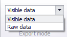
For the Export mode, you can choose between the two options Visible data and Raw data. The setting made here refers to the export via the reporting interface, i.e. it is relevant for both the PowerPoint and Reporting plug-ins. •Raw data exports all data regardless of the filters set. •Visible data exports the data that is displayed (filters are respected) |
2.3 Information and Interaction Bar
The information and interaction bar for the Table plug-in (see Figure 2) offers a simple option for switching quickly between the individual records.
It also enables you to view the total number of records and the number of the specific record selected.
Figure 2 - Information and interaction bar
This toolbar also comprises the edit function. You can add, edit and delete records. The individual toolbar options are presented in detail below.
Button |
Description |
|
Switches to the first record and selects this. |
|
Switches to the previous display page (a page is the content of a window). |
|
Switches to the previous record and selects this. |
|
Switches to the next record and selects this. |
|
Switches to the next display page (a page is the content of a window). |
|
Switches to the last record and selects this. |
|
Adds a new record at the end of the table. |
|
Deletes the record currently selected. |
|
Enables the edit function for the record selected. You can now edit this. |
|
Ends the current editing process. Please ensure that once you have finished editing, you also conclude the superordinate editing process by choosing Commit in the plug-in menu. This is necessary to ensure that any new data is saved. You can then disable the edit function again by choosing Edit again. |
|
Cancels the current editing process and discards the changes. |
3.1 How to Add and remove Data
To add data to the plug-in, select the desired source and add this to the target area. You can also add several data sources to the target area.
To do so, simply make a multiple selection by selecting several database tables, for example, and then move them to the plug-in window for the Table plug-in using Drag&Drop.
You do not have to clear the table, before showing new data. You can just drag the new data into the Plug-in-Window and SimAssist updates the view immediately.
Once you have added to the plug-in the data you want to display in a table, you can work with this data. You can view all the records contained and change their values.
To change the table display, and thereby adapt it to your requirements, you can move columns and filter the display by specific values.
To move a column within the content display, you can use Drag&Drop to move it to the desired position (see Figure 3).
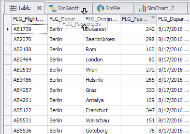
Figure 3 - Move columns
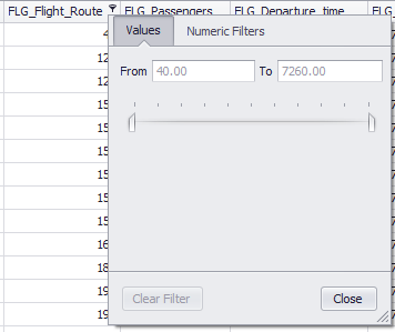
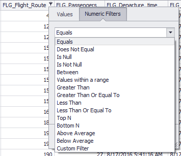
To filter columns by specific values or to restrict the display to specific values, choose the filter icon  next to the column name (see Figure 4).
Depending on the data type (DOUBLE in this case), a corresponding filter menu is displayed.
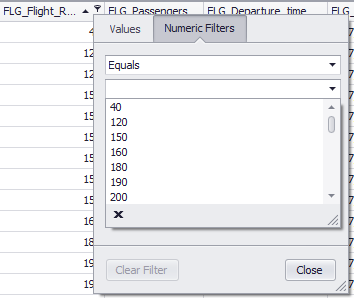
In this example, you can filter either by a range of values (Figure 4) or by individual numerical values (Figures 5 + 6).
Figure 4 - Value range |
Figure 5 - Numeric filter |
Figure 6 - Numeric filter |
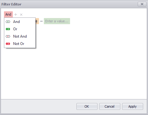
Via the Edit filter button (accessible via the context menu or via the status bar (if a filter has already been set)) you can call up the advanced filter function (see Figure 7).
This offers a comprehensive and extended filter option, with which you can make your data selection even more individual.
By clicking on the operator (default: And) you can select the different operators available and add a corresponding filter rule by clicking on the plus symbol.
Figure 7 - Edit Filter |
Figure 8 - Choose operator |

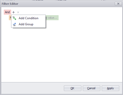
By clicking on the +-icon, conditions or groups can be added.
A group adds a new group to the filters - this way, when using multiple filters, you can organize the individual filter specifications and always keep the overview.
Figure 9 - Choose operator |
Figure 10 - Choose operator |

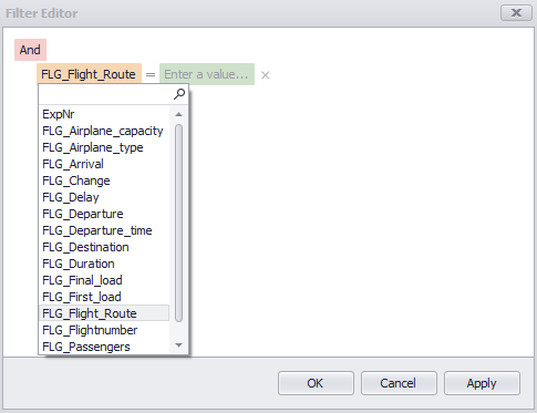
The individual filters are always structured in three parts. Thus, each filter starts with the corresponding column to which the condition is to be applied.
Clicking on the preset column (here: FLG_Flight_Route) opens a context menu listing all columns available in the table (see Figure 11).
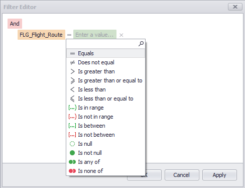
The second section of a filter is the condition itself. Clicking on the condition again opens a context menu that provides all available conditions for selection (see Figure 12).
Figure 11 - Choose column |
Figure 12 - Choose operator |
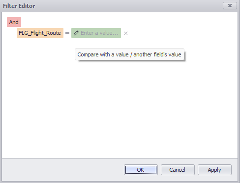
The third and last section of a filter represents the value to be filtered by. By clicking on the text Enter a value..., you can make your entry there (see Figure 13).
By clicking on the pencil icon, you can directly compare two data fields (see Figure 14).
A click on Apply saves the filter settings, a click on OK closes the filter editor.
Figure 13 - Enter a value |
Figure 14 - Compare data fields |

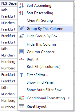
You can call the plug-in’s context menu by right-clicking in the table header (see Figure 15). Different interaction options are available here depending on the column you have clicked in.
You can therefore, for example, automatically sort content, undo all sorted content and remove the relevant column.

Figure 15 - Context menu
The table below provides an overview of all the functions in the context menu.
Button |
Function |
||
|
Sorts the entire table content in descending order.* |
||
|
Sorts the entire table content in ascending order.* |
||
|
Groups the entire table content based on the current column. |
||
|
Opens the Group Box, which can be used to group the table content. |
||
|
Visually removes the column in question from the display. |
||
|
Opens the Customization window for the Column Selection which can be used to customize the column layout more conveniently. |
||
|
Adjusts the width of the current column to fit its content. |
||
|
Adjusts the width of all columns to fit the relevant content. |
||
|
Opens the Filter Editor window in which you can individually customize filters. |
||
|
Displays the Search function, which can be used to search the entire table content. |
||
|
Shows the Auto Filter Row, which can be used to quickly filter columns. |
||
|
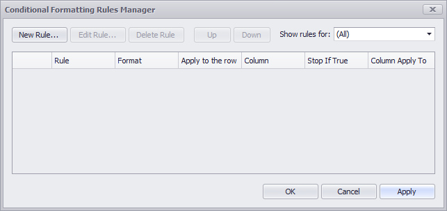
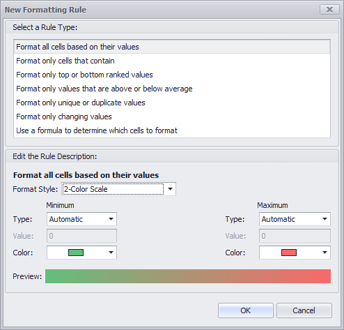
The content of the corresponding menu depends on the format of the column in which the context menu entry was selected. The following screenshot is displayed for the data type Double
Clicking on Manage Rules... opens the following edit mode, where a number of rules for formatting the existing columns can be configured.
By clicking on New Rule this rule can be created.
Detailed information about this feature can be found here. |
||
|
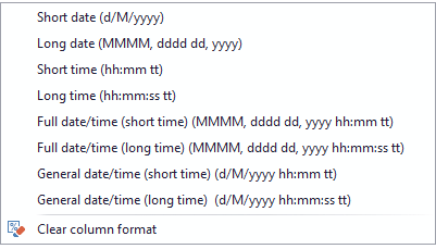
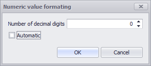
Defines the desired format of the corresponding column, either for DateTime or for Numeric columns
|
||
|
Restores the table layout to the original layout. |

* You can also access the function for sorting a column by left-clicking the relevant column header.
You can use the Group By This Column function to group the entire table content based on the current column (see Figure 16).
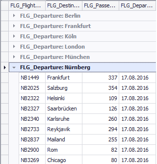
Once you have grouped the table based on a specific column, the entire table content is divided into different groups, on the basis of the different values contained in the column selected (see figure 17).
In the example shown below on the screenshots, the table content has been divided on the basis of the FLG_Departure column.
This results in the six categories Berlin, Frankfurt, Köln, London, München and Nürnberg.
Figure 16 - Grouping |
Figure 17 - Result grouping |
Group by box
You can display the grouping field by choosing Show Grouping Field in the context menu (see Figure 18). You can use this field to achieve the same as with the Group By This Column function.
To this end, use the Drag&Drop function to drag the desired column to the grouping field; the entire table content will then be grouped on the basis of this column.
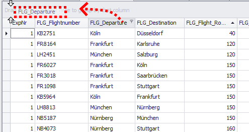
Figure 18 - Group by box
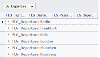
Figure 19 shows the table which has been grouped on the basis of the FLG_Departure column.
The entire content is now categorized in the six different Type column values: Berlin, Frankfurt, Köln, London, München and Nürnberg.
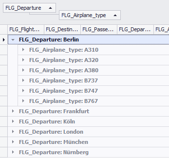
You can also nest the categorizations as desired. To do so, simply move additional column headers belonging to the desired columns to the grouping field.
Each column is now a sub-categorization of the previous categorization (see Figure 20).
In the example below, the FLG_Airplane_type column therefore further subdivides the previous categorization on the basis of the FLG_Departure column.
Figure 19 - Grouped table |
Figure 20 - Nested grouping |
You can manage the grouping field via the context menu (see Figure 21); the following functions are available when you right-click the field:
Figure 21 - Context menu |
•Expand All Groups •Collapse All Groups •Reset Grouping •Hide Grouping Field •Restore Layout |

You can open the customization window by choosing Column Selection (see Figure 22). You can now use Drag&Drop to position any columns here, and thereby remove them from the table display.
This enables you to hide any columns you do not need and to optimize the display. You can move the columns now contained in the customization window back to the table at any time.
The Column Selection function is therefore also ideal for sorting columns in the table manually.
|
Information Columns that have been removed via the context menu item Hide this column can also be found in the Customization dialog. |
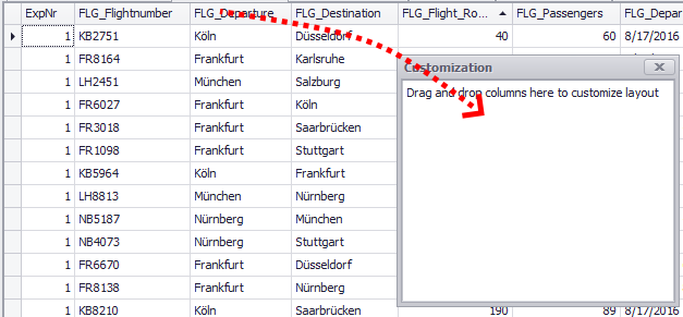
Figure 22 - Column Chooser
When you choose Display Search Panel, a search bar appears above the table (see Figure 23).
When you make an entry in the search bar and then choose Find to confirm your entry, SimAssist searches the entire table content for the relevant entry and highlights all hits.
You can choose Clear to reset the search and remove the highlighting. To close the search bar, and thereby exit search mode, choose the X icon to the left of the input field.
The search is not "CaseSensitive", i.e the search string "fr" also returns results like "FR ..." or "Fr ...".
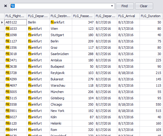
Figure 23 - Search
To display the auto filter row, choose the Show Auto Filter Row button. This function enables you to quickly and easily filter the table content.
A separate input field for each column is available below the table header containing the header line. The table is filtered on the basis of the value you enter in the relevant input field.
By clicking on the icons of the respective column, the type of filter can also be adjusted (see Figure 25).
Figure 24 - Auto Filter Row |
Figure 25 - Auto Filter Row |

You can choose Options in the main SimAssist menu to make plug-in-specific settings (see the Options section). The following change options are available for the Table plug-in:
Option |
Description |
Edit |
|
Edit Queries |
Allows you to edit data where the source is a query defined in SimAssist (true: permitted, false: not permitted). |
View |
|
Automatic column best fit |
Applies the option from the context menu “Best fit all columns” when a new data source is connected. |
How to Export the whole Table into a CSV file
The function Export (see Plug-in-Menu) enables you to export the table's data into an external CSV file.
By clicking on the Export button the export dialog will open (see figure 26)
Figure 26 - Export CSV |
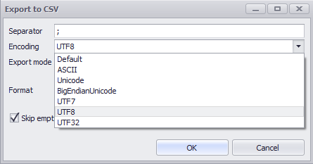
Figure 27 - Encoding |
Figure 28 - Export mode |
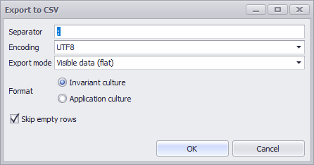
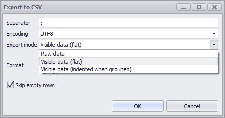
Explanation of the export mode
•Raw data
oExports all data from the table, regardless of set filters or groupings
•Visible data (flat)
oExports the data that is currently displayed in the plug-in
oFilters are respected
oGroupings are ignored
•Visible data (indented when grouped)
oExports the data that is currently displayed in the plug-in
oFilters are respected
oGroupings are respected
Quick export via copy&paste
You can export the table content to any other application, such as Microsoft Excel, using Copy and Paste.
To do so, simply select the desired section of table content by dragging the mouse or, if you wish, the entire table, using the shortcut CTRL + A:
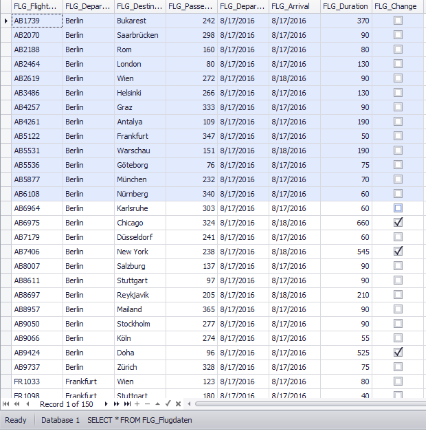
Figure 29 - Select Content
© SimPlan AG - Hanau District Court, Commercial Register (Part B) 6845 - info@simplan.de - www.simplan.de/en