The following comprises instructions for the SimPie plug-in.
Contents
1. Introduction to the plug-in
1.3 Position in the Overall Software Package
2. Interface, Layout and Options
1. Introduction to the plug-in
The SimPie plug-in enables you to visualize complex data in a clear, dynamic pie chart, and thereby simplify the evaluation of this data.
SimPie represents your data in a multidimensional pie chart – you can customize how the data contained is divided up, and thereby define exactly how you want the data to be visualized.
The tool allows you to see at a glance how the distribution of your data is organized. The Pivot Fields and Chart Designer buttons can be used to extensively customize the pie chart.
1.3. Position in the Overall Software Package
The SimPie plug-in is part of the 2view module, which also contains the SimChart, SimGantt and SimVis plug-ins.
SimPie is available when you license the 2view module for SimAssist.
1.3.2. Links to Other plug-Ins
The SimPie plug-in is linked to a total of five other plug-ins.
The first plug-in it is linked to is the Database Definition plug-in, which acts as a data source, and therefore provides the data pool to be calculated for the distributions.
With the SQL Statements plug-in, the data pool can be individually specified using SQL queries. Also, the data source can be specified in more detail using the Variables plug-in.
The fourth link represents the connection to the PowerPoint plug-in, which allows the graphics and tables generated in SimPie to be exported to a PowerPoint presentation.
The connection to the Reporting plug-in represents the fifth link.
2. Interface, Layout and Options
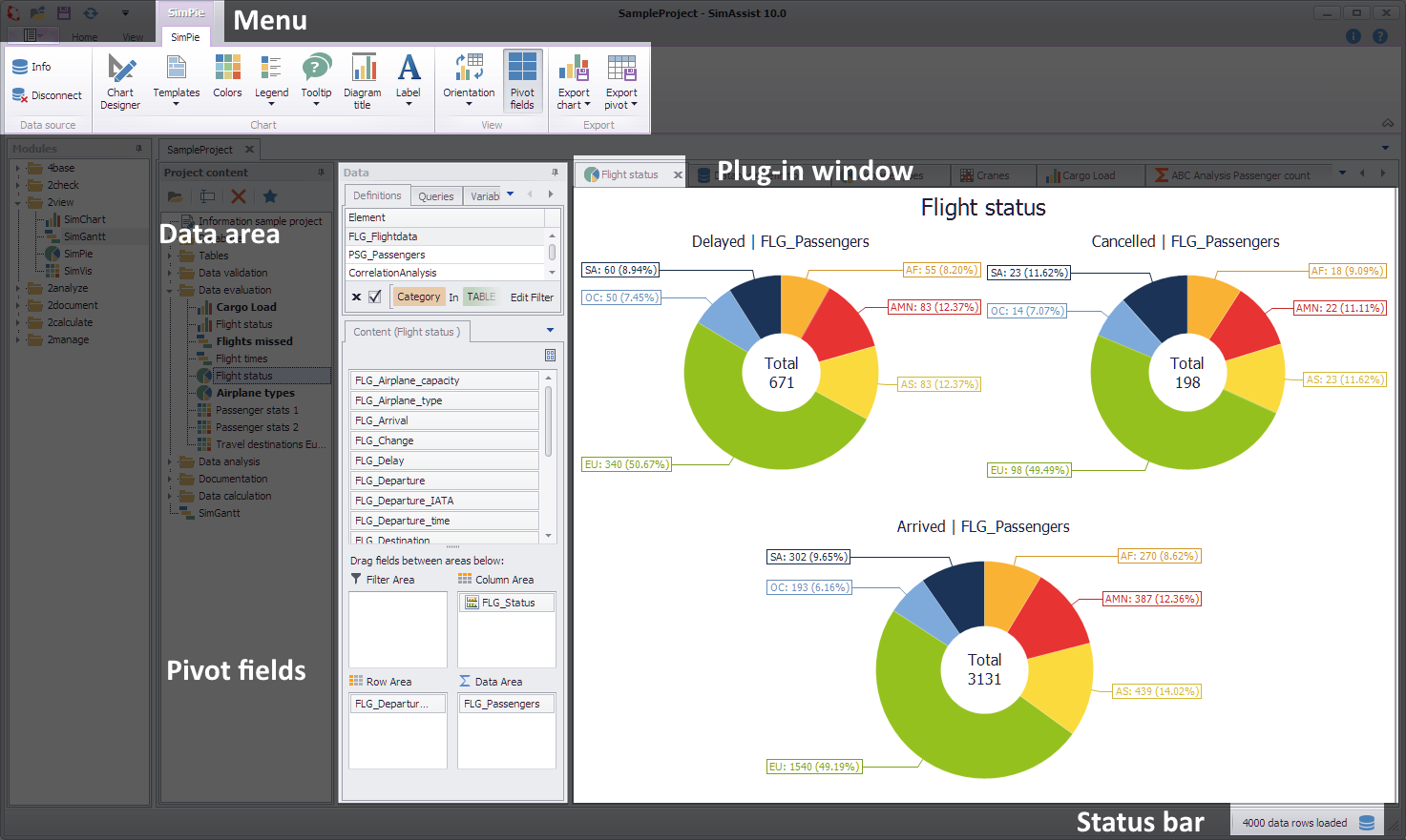
Figure 1 - Layout of the SimPie plug-in
The plug-in SimPie is divided into four areas. First of all, the visualization of the data realized via one (or more) pie charts is centrally located in the chart area.
In the upper area is the menu of the plug-in, in which the most important functions of the plug-in are available.
Using the Chart Designer, the created diagrams can be adjusted in detail. On the left side you will find in the data area the previously added data from the connected database.
Below these are the Pivot Fields, which generate the charts by filling in data from the data area.
Options
In the Options in the main menu of SimAssist you can make plug-in specific settings (see chapter Options). The following options are available for the SimPie plug-in:
Option |
Description |
Diagram |
|
Show end value |
Specifies the default value whether the end value of an interval is shown or not. This is applied when a new plugin-in instance is created. |
X-axis zooming |
Specifies the default value whether zooming is allowed for the diagram's panes along their X-axes. This is applied when a new plugin-in instance is created. |
Y-axis zooming |
Specifies the default value whether zooming is allowed for the diagram's panes along their Y-axes. This is applied when a new plugin-in instance is created. |
Grouping |
|
Complement intervals |
Specifies whether missing intervals are complemented. |
Interval type |
Determines how numeric values or dates are assigned to a range. |
Maximum interval count |
Defines the maximum interval count that can be created by the grouping. |
Substring mode |
Sets the direction of the substring operation when grouping alphanumeric values. |
PivotChart |
|
Orientation |
Specifies the default orientation for new diagrams. This is applied when a new plug-in instance is created. |
Templates |
|
Default template |
This template is applied once when creating a new instance. |
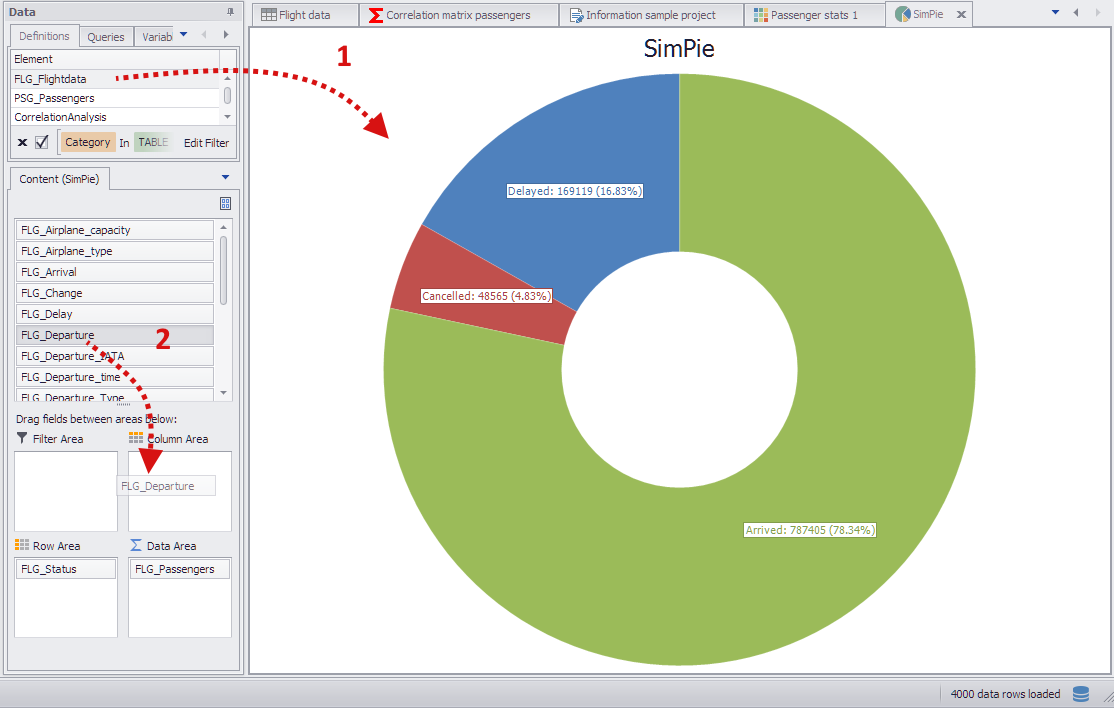
Figure 2 - Adding data
To add data to the plug-in, a database must first be connected to the plug-in (see Figure 2 [1]).
This step populates the content area with columns from the database. Now the columns can be distributed to the Pivot Fields (see figure 2 [2]).
There are several possibilities, which are shown below by way of example.
In this example, the columns are distributed to the Pivot Fields as follows (see Figure 3).
•FLG_Departure in the Column area
•FLG_Status in the Row Area
•FLG_Passengers in the Data Area
The column in the Column Area contains departure airports (filtered on 3 airports), therefore a total of 3 pie charts are displayed.
The subdivision of the individual diagrams takes place via the column FLG_Status in the field Row Area.
The column FLG_Passengers in the Data Area provides the actual data for the evaluation. The display can be additionally influenced via the filter icons of the respective Pivot Fields.
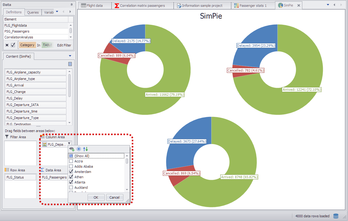
Figure 3 - Data distribution example 1
In this example, the same columns were used as in Example 1. However, the columns were split differently among the Pivot Fields:
•FLG_Status in the Column Area
•FLG_Departure in the Row Area
•FLG_Passengers in the Data Area
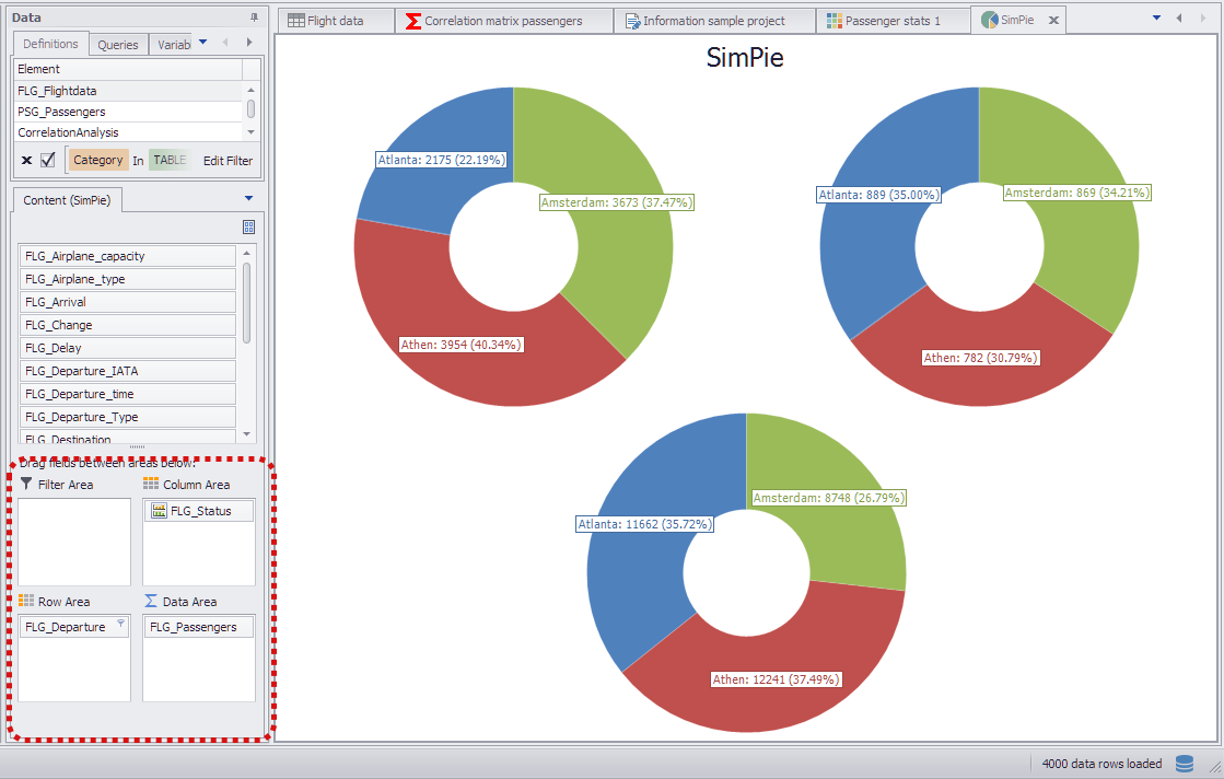
Figure 4 - Data distribution example 2
In this example, the columns are distributed to the Pivot Fields as follows (see Figure 5).
•FLG_Departure and FLG_Status in the Row Area
•FLG_Passengers in the Data Area
If multiple columns are used in the row area of the Pivot Fields, a nested display of the pie chart results. The order of the columns in the row area also plays a role and can be easily changed by using Drag&Drop.
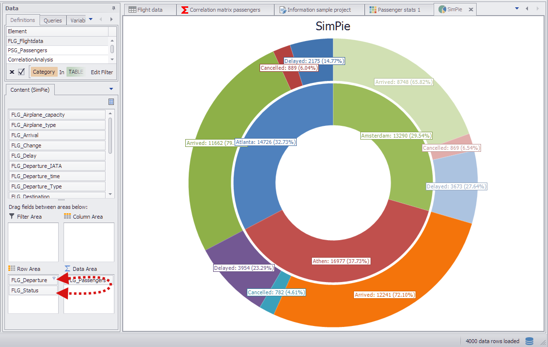
Figure 5 - Data distribution example 3
© SimPlan AG - Hanau District Court, Commercial Register (Part B) 6845 - info@simplan.de - www.simplan.de/en