The following comprises instructions for the Distribution Fitting plug-in, as well as an example use case to provide more detailed step-by-step instructions.
Contents
1. Introduction to the plug-in
1.3 Position in the Overall Software Package
1. Introduction to the plug-in
The Distribution Fitting plug-in enables you to automatically find the most ideal distribution for your data and to calculate the associated parameters and values.
An efficient calculation algorithm finds the most suitable distribution for your data quickly and automatically. The following distributions are taken into consideration here:
|
Information: The two distributions Erlang and Gamma are implemented in the plug-in based on the definition from the documentation of Tecnomatix Plant Simulation Version 2201. |
|
Information: The calculated p-value depends on the sample size. For very large data, it therefore becomes 0, even if the distribution fits the data well visually. With large data, these would have to follow the distribution very closely in order to obtain a significant p-value. |
Special features of the Erlang distribution:
The parameters of the Erlang distribution cannot be determined by the math library used in SimAssist.
Instead, an approximation method is used. For this reason, no p-value can be determined and therefore the Erlang distribution cannot be considered when suggesting the most suitable distribution.
The Erlang distribution is a special gamma distribution whose shape parameter Alpha is integer.
Due to the lack of support for the Erlang distribution in popular .NET math libraries, parameter determination is performed using the following approximation procedure:
1. Determination of the parameters alpha and beta of a gamma distribution by the fitting procedure of the library Meta-Numerics.
2. Generation of 2 Erlang variants by rounding up and down the alpha parameter.
3. For each variant:
a. Adjustment of beta to obtain the original mean
b. Generation of 100 data points evenly distributed over the range of values of the input data.
c. Calculating the sum of the squared deviation of the variant from the initially determined gamma distribution at each data point.
4. Selection of the variant with the lowest deviation sum
5. Determination of the mean and standard deviation of the selected Erlang distribution
Following calculation, a flexible, dynamic visualization is displayed in the form of a chart, which you can adapt accordingly to your requirements.
This means that you can display and hide individual distributions – ideal for directly comparing an individual selection of distribution graphs.
To view your data in detail and evaluate it effectively, you can also zoom in and out of the chart and pan it, which enables you to focus on the exact area of the visualization currently of interest to you.
You can also export the chart – in the desired, personal view – to any number of documents via the clipboard
|
Information Scale factor: The bar chart „Own values“ shows the data input as a histogram. The number of values within one interval and therefore also the original height of the bars depends on the number of intervals. The fewer the intervals the more values fall within a particular interval. The bar heights are scaled with a factor to improve the comparability between the histogram and the line charts of the density functions. The bar height (y-axis value) of an interval is calculated with the following formula:
Consequently, the sum of all y-values does not equal 1 contrary to a normalized histogram. |

1.3. Position in the Overall Software Package
The Distribution Fitting plug-in is part of the 2analyze module, which also contains the Categorization, Confidence Interval, ABC Analysis and Correlation Matrix plug-ins.
Distribution Fitting is available when you license the 2analyze module for SimAssist.
1.3.2. Links to Other plug-ins
The SimPie plug-in is linked to a total of three other plug-ins. The first plug-in it is linked to is the Database Definition plug-in, which acts as a data source, and therefore provides the data pool to be calculated for the distributions.
With the SQL Statements plug-in, the data pool can be individually specified using SQL queries. Finally, you can also export the chart to a Reporting document, using the clipboard function, where you can integrate it in your project documentation.
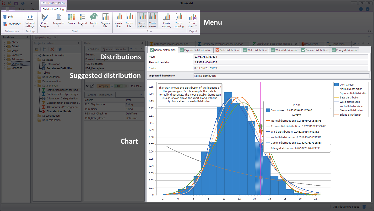
Figure 1 - Layout of the Distribution Fitting plug-in
The Distribution Fitting plug-in menu can be found at the Menu of the frame application (see Figure 1).
In the upper part of the plug-in window the tabs of the different distributions, each containing the associated calculated values, in particular the p-value.
Where the calculation has yielded meaningful results, the most suitable distribution for your data will be recommended in the Suggested Distribution field.
At the bottom of the plug-in window, the distributions are visualized in a chart, which you can evaluate and manage using the legend on the right.
At the plug-in menu the data source can be edited. A detailed explanation of the individual buttons of the menu can be found in the chapter Pivot Chart.
The Interval settings button opens a dialog in which the interval width can be edited.
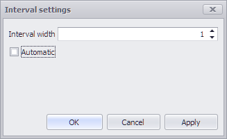
Figure 2 - Interval settings
|
Information Editing the interval width is only possible here if Automatic has been deactivated. Invalid entries (interval width <= 0) are not permitted in the interface. |
If the interval width is not set (Automatic mode), the interval width is determined as before from the global parameter Number of X-axis values (histogram) and the value range of the data.
Otherwise, the specified value applies. Interval widths are defined for each plug-in instance, saved with the project and restored when loading.
|
Information If the interval width is selected incorrectly, a large number of intervals may have to be drawn, which can temporarily block the user interface. |
You can choose Options in the main SimAssist menu to make plug-in-specific settings (see the Options section). The following change options are available for the Distribution Fitting plug-in:
Option |
Description |
Diagram |
|
Number of X Values (Histogram) |
Defines the number of bars that the histogram consists of. |
Number of X Values (Line) |
Defines the number of points used to calculate the lines. |
Show end value |
Specifies the default value whether the end value of an interval is shown or not. This is applied when a new plugin-in instance is created. |
X-axis zooming |
Specifies the default value whether zooming is allowed for the diagram's panes along their X-axes. This is applied when a new plugin-in instance is created. |
Y-axis zooming |
Specifies the default value whether zooming is allowed for the diagram's panes along their Y-axes. This is applied when a new plugin-in instance is created. |
Grouping |
|
Complement intervals |
Specifies whether missing intervals are complemented. |
Interval type |
Determines how numeric values or dates are assigned to a range. |
Maximum interval count |
Defines the maximum interval count that can be created by the grouping. |
Substring mode |
Sets the direction of the substring operation when grouping alphanumeric values. |
Pivotchart |
|
Orientation |
Specifies the default orientation for new diagrams. This is applied when a new plug-in instance is created. |
Templates |
|
Default template |
This template is applied once when creating a new instance. |
Drag&Drop
You can add data to the plug-in using Drag&Drop (see figure 3).
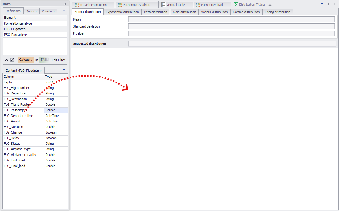
Figure 3 - Adding data
Zoom
You can zoom in and out of the plug-in’s chart. To do so, move the cursor over the chart and use the mouse wheel.
Pan
You can pan the chart, that is, you can move the display to the left or right on the horizontal axis.
To pan, click the desired position in the histogram and move the mouse sideways while pressing and holding down the left mouse button.
As the basis for calculating the distribution fitting, only numerical values are permitted. Please therefore ensure that the data pool for the distribution fitting contains legitimate data.
4.1.2. Data Sources and Calculation
To add data to the plug-in, select the desired source and add this to the target area (see figure2). The calculation is started automatically.
Once the calculations are complete, the suggested distribution and its values are displayed in the middle of the plug-in window. You can use the tab bar to switch between the results of the individual distributions.
While a green check mark icon ![]() indicates that the distribution in question has yielded meaningful values, a red X icon
indicates that the distribution in question has yielded meaningful values, a red X icon ![]() means that no meaningful results have been achieved, and the distribution in question could therefore
means that no meaningful results have been achieved, and the distribution in question could therefore
not be applied to the input data. Below this, all distributions are visualized in a chart.
The Chart
The data is visualized by a dynamic histogram, which integrates the graphs for the different distributions.
You can use the legend on the right of the screen to enable and disable the individual graphs and the input data display.
To maintain an overview at all times and, at the same time – if desired – view your data in detail, you can freely zoom in and out of and pan the chart width-ways.
You can export or copy the chart to the clipboard, including the distribution graphs, by clicking the button Export Chart in the menu.
From here, it can be added to a 2document module Reporting document, or any other external SimAssist document, such as a Microsoft Word document.
Please note here that the current chart view, that is, the view with the current zoom level and panning area, is always exported.
The following section presents an example use case for the Distribution Fitting plug-in. It serves to explain the functionality and use of the plug-in on the basis of real data.
Step 1
If you have not already done so, you need to create a connection to a database containing the data intended for the distribution fitting using the Database Definition plug-in (see Databasedefinition).
In the following example, the distribution fitting is to be applied to a series of measurement values for process times for various plant machines.
In this example case, the database therefore contains several tables, containing the relevant time measurement values for the different plant machines, read via the data plug-in Table (see Figure 4).
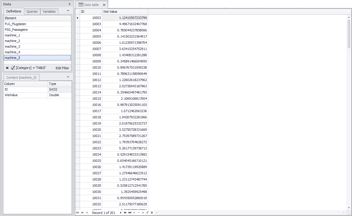
Figure 4 - Measurement series for the process times for different plant machines
Step 2
If you have not already done so, you now need to add the Distribution Fitting plug-in to your project content area.
In the project window, choose the Data tab at the bottom of the project content area.
Now use Drag&Drop to move the desired data pool to the Distribution Fitting plug-in window (see Figure 5).
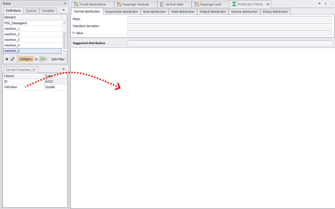
Figure 5 - Add data to the Distribution Fitting plug-in
Step 3
You can add to the Data Source area individual columns, tables or database queries created previously using the SQL Statements plug-in.
To use database queries as the data source for the distribution fitting, choose the Queries tab in the data window (see Figure 6) and move the desired query to the plug-in window.
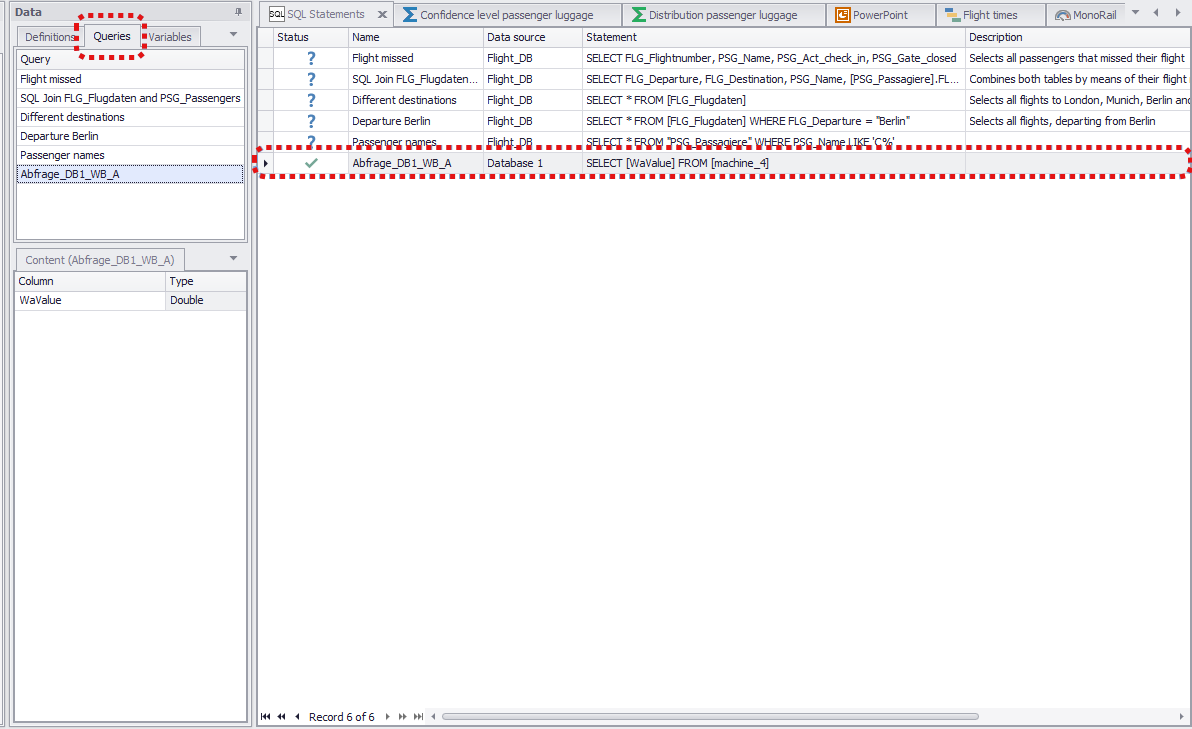
Figure 6 - Use SQL query as data source
Step 4
If a measurement series is divided between several columns, you will be able to add several columns from the relevant table to the Distribution Fitting data pool without any problem.
To do so, just hold the Ctrl-Key and select the desired columns in the content area and drag them into the plug-in window.
Adding the data starts the calculation automatically.
Once the calculations are complete, SimAssist will suggest the distribution that makes the most sense for your input data, state the distribution-specific values calculated, e.g. the exact p-value, and visualize all distributions in the form of a dynamic chart (see Figure 7).
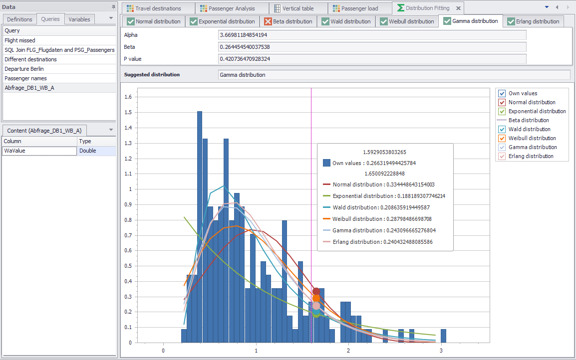
Figure 7 - Visualization of the distributions
Step 5
You can use the tabs for the distributions to switch between the values calculated for the individual distributions.
The green check mark icon ![]() in the tabs for the distributions indicates that the associated distribution yields meaningful results – here, this is the case for all distributions.
in the tabs for the distributions indicates that the associated distribution yields meaningful results – here, this is the case for all distributions.
If a given distribution does not yield any suitable results, this is indicated in the relevant tab by a red X icon ![]() – in this case, no values are output and no data is visualized in the chart.
– in this case, no values are output and no data is visualized in the chart.
You can use the legend to the right of the visualization to enable or disable the graph for each distribution individually as well as the chart containing your own values.
To view the chart in detail – to manage individual values, for example – you can zoom in and out of the chart using the mouse wheel and then press and hold down the mouse button to pan the horizontal axis, and thereby navigate to the desired area.
If you want to add the visualization of the distributions to your project documentation or simply extract it as a graphic, you can store an image of the current visualization (your current view, therefore also the current zoom level, is always stored) in the clipboard, export the distributions as PDF or image.
© SimPlan AG - Hanau District Court, Commercial Register (Part B) 6845 - info@simplan.de - www.simplan.de/en