The Chart type Tree displays data in a clear treemap.
Contents
Treemap can be used to quickly identify relationships between different data sets, more precisely, a grouping of related data takes place.
But not only the togetherness is visualized, by another level of representation, it is possible to clarify weights. Figure 1 shows a treemap created by SimVis Tree.
Clearly visible are the different, separated by different colors groups of records. In addition, it becomes clear that the individual areas have different sizes and thus visualize the weighting of the underlying data sets.
For more detailed instructions on interpreting the presentation, see Visualization interpretation in this chapter.
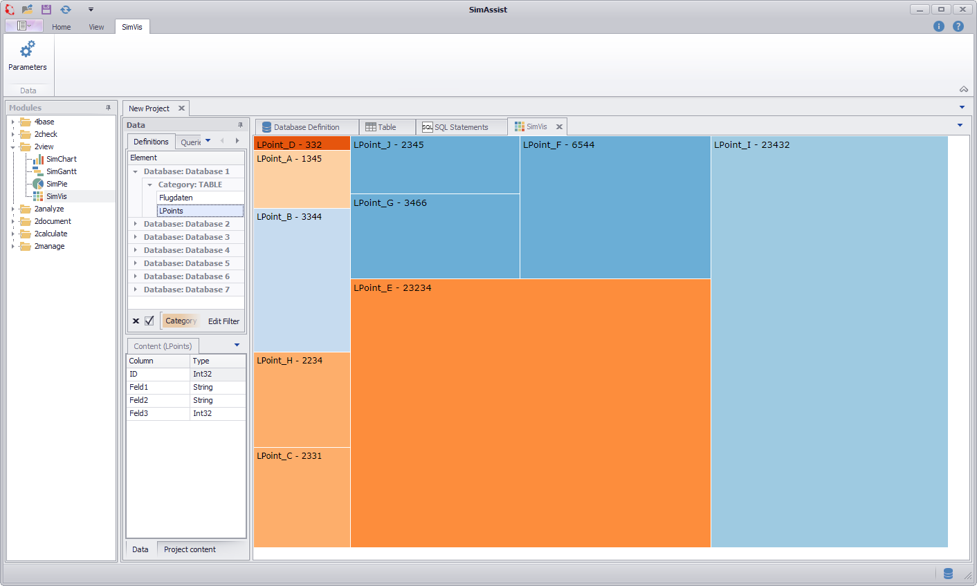
Figure 1 - SimVis Tree overview
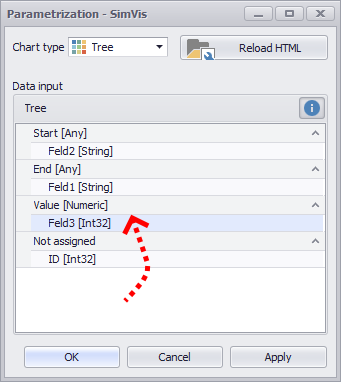
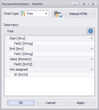
The important thing is how you distribute the individual columns of your data source to the different nodes - this directly influences the visualization. There are three different nodes available:
•Start: The Start area picks up the values from which connections originate.
•End: The End area indicates the values to which the connections lead.
•Value: The Value area is responsible for the weighting, ie. the numeric values of the column in the Wert area determine the dimension of the associated connection

Figure 2 - Nodes Chord
As soon as you have distributed the columns to the different nodes, you can create the diagram by clicking on OK or Apply.
Figure 3 - Adding data |
Figure 4 - Distribute columns |

In order to be able to interpret the visualization correctly, it is first of all important to understand the corresponding information that the representation provides.
The following figure shows a visualization, which is based on a fictitious data set of a simplified simulation model:
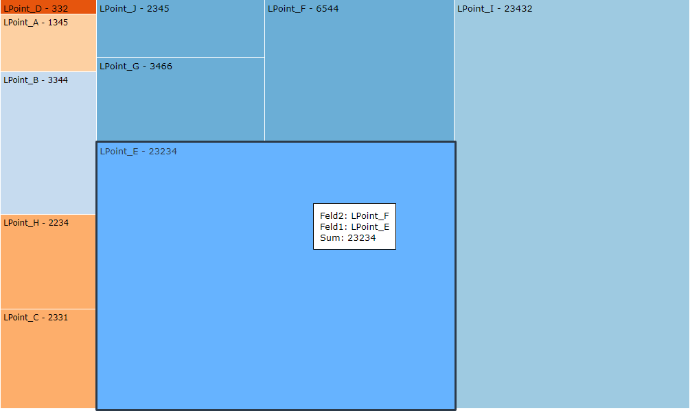
Figure 5 - Tree Chart visualization
This data record contains various reporting points, each of which states which successor reporting point you have and how often a transport unit is sent to this successor reporting point.
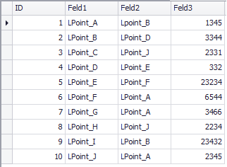
In tabular form, the data record just described can be seen in Figure 6. The three columns were distributed to the nodes as follows (see Figure 7).
Figure 6 - Tree Chart data
•Feld 1: reporting points •Feld 2: Successor reporting points •Feld 3: Number of forwarded transport units |
Figure 7 - Tree Chart nodes |
SimAssist grouped the records based on the Feld 2 column of the above table because this column was mapped to the Target drop-down. Accordingly, the following relationship arises, which represents the visualization:
Figure 5 - SimVis Tree interpretation 1 |
The individual colors represent the individual groups (formed from the values of column field 2), for example, the group marked in white on the adjacent figure is defined by a dark blue color scheme.
The individual areas within the group now represent the components (taken from the column field 1) that make up this group.
So the records with the values LPoint_J, LPoint_G and LPoint_F in the field Field 1 have the same value in the field Field 2 because they have been grouped together.
Behind each designation of the group components (here LPoint_J, LPoint_G and LPoint_F), the numerical value from the field 3 field is specified.
This value is directly related to the size of the corresponding rectangle of the associated group component - the larger the value, the larger the rectangle of the component. |
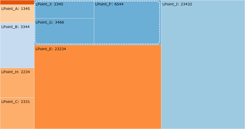
Figure 6 - SimVis Tree interpretation 2 |
In order to see further information about a group component - such as the name of the parent group - you can call up a pop-up window by moving the mouse pointer over the corresponding component (see adjacent figure).
The corresponding group component is highlighted and you get the information about the three columns as well as the corresponding values in the popup window.
In this case, the name of the group can be found under field 2 (LPoint_A). |
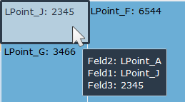
But what exactly illustrates the above group named LPoint_A?
It shows at a glance which reporting points transport units send to the follow-up notification point LPoint_A. These reporting points are the respective group components:
•LPoint_J
•LPoint_G
•LPoint_F
Furthermore, it is immediately apparent how many transport units reach the reporting point LPoint_A (numerical value after the name of the group components) starting from these reporting points.
The size of the rectangles is calculated using the values in the column Field 3 and visualizes the number of transport units - so you can see at a glance the proportions of the individual group components and beyond the corresponding ratios of the groups to each other.
© SimPlan AG - Hanau District Court, Commercial Register (Part B) 6845 - info@simplan.de - www.simplan.de/en