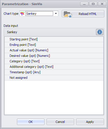
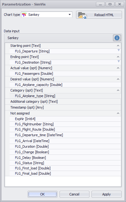
The Chart type Sankey displays data in a clear and interactive Sankey chart.
Contents
3. Visualization interpretation
4. Sample calculation for Desired-Value
The Sankey chart of the SimVis plug-in represents mass flows and networks. The user can poke the display in order to, for example, copy their own structures.
The chart can compare flow rates with specifications and thus map the performance of the network. As a further option for comparisons, a background graphic can also be integrated.

Figure 1 - SimVis Sankey overview
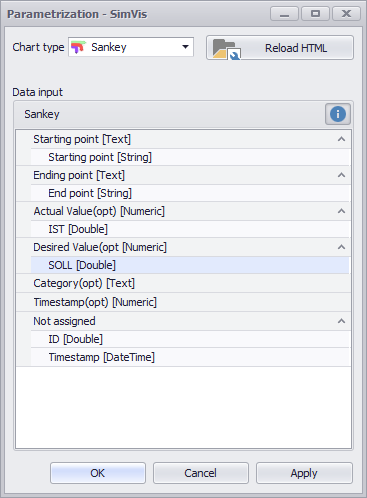
The important thing is how you distribute the individual columns of your data source to the different nodes - this directly influences the visualization.
There are seven different nodes available. The following table serves as an explanation for the individual nodes:
Figure 2 - Nodes Sankey |
|
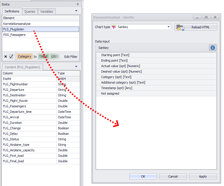
As soon as you have distributed the columns to the different nodes, you can create the diagram by clicking on OK or Apply.
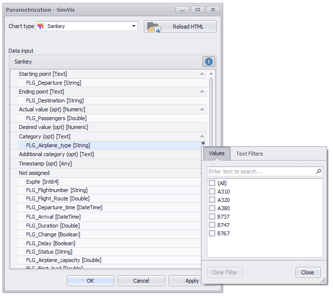
The filter icon in each row can be used to set any number of filters per added column (see Figure 4).
Figure 3 - Adding data |
Figure 4 - Distribute columns |
3. Visualization interpretation
In order to be able to interpret the visualization correctly, it is first of all important to understand the corresponding information that the representation provides.
The following figure shows a visualization, which is based on a fictional data set with flight data, with the help of which the interpretation should now be explained.
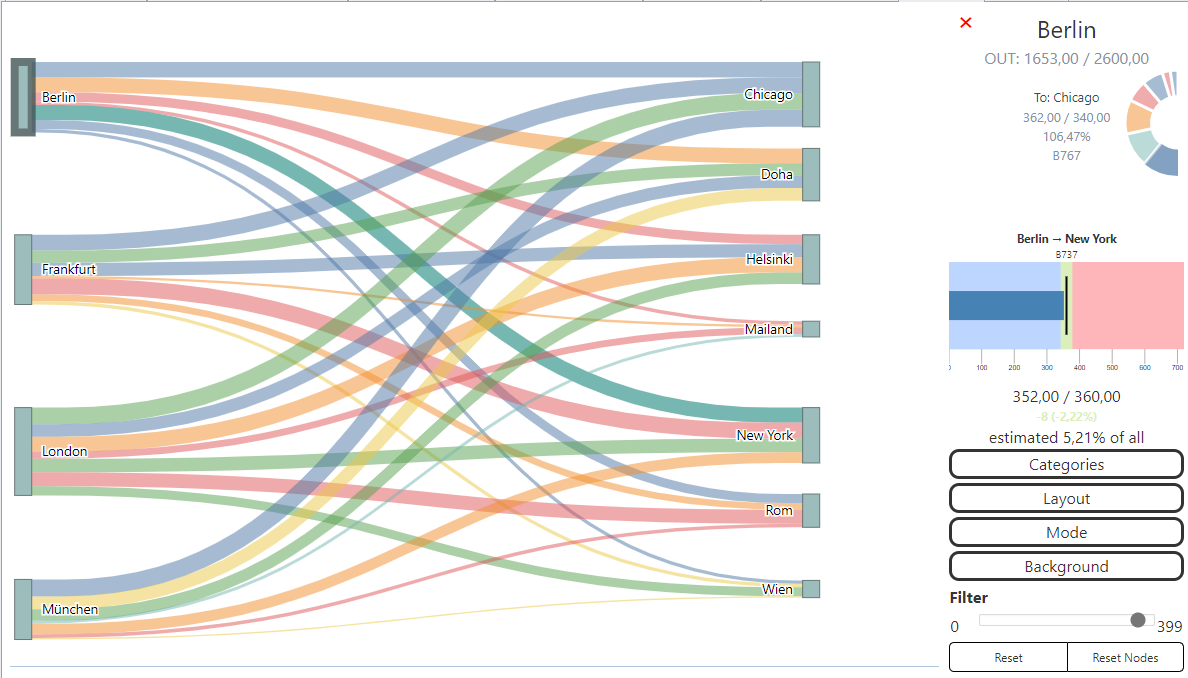
Figure 5 - Sankey with flight data
This record contains flight connections, each of which specifies:
•From which airport do the connections go
•Which destination airport is headed
•How many passengers will be transported over this connection
•How many passengers fit into the machines
•Which type of aircraft is the particular machine
Tabular shown is the record just described as shown in Figure 6. The five columns were distributed to the nodes as follows (see Figure 7).
Figure 6 - Sankey Chart data |
Figure 7 - Sankey Chart nodes |

By clicking on OK or Apply the chart is created. Now the individual areas of the diagram are explained:
Figure 6 shows the actual Sankey diagram. To the left are the departure airports (London, München, Berlin and Frankfurt), to the right are the destinations.
The width of the individual connecting lines gives a first indication of the number of passengers.
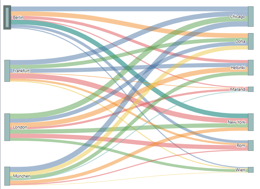
Figure 8 - Sankey Chart
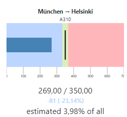
In this example, the Munich airport is marked, according to which further details are displayed for this airport (see Figure 9).
All points (airports in this example) can be dragged and dropped anywhere in the chart area using Drag&Drop.
Zooming is possible by double-clicking or using the mouse wheel in this view. Holding down the left mouse button, the entire diagram can be moved on the canvas.
By holding down the CTRL key, several nodes can also be selected and moved at once.
Figure 9 - Details Airport München 1 |
If a point in the diagram (in this case an airport) is selected, a detailed view of the selected point appears on the right-hand side of the plug-in window. Inputs and outputs are summarized and also displayed individually via two circle segments. The example in Figure 9 shows that Munich Airport has no incoming and 7 outgoing (right semicircle) connections. Depending on the data basis, more or less information about the connected flows is displayed.
|
Figure 10 - Details Airport München 2
|
If an edge (connection) is selected by clicking on it, it is displayed in a second menu. Several edges can be selected by holding down the control button. In addition, an estimate is made of how much of all the flows this edge takes up. However, this information is not context-sensitive, i.e. return flows or splits are not taken into account. This example shows that the flight from Munich to Helsinki is under-seated by 81 passengers (23.14%). The A310 aircraft has space for 350 passengers, but 269 are only on board. To display this view, both ACTUAL and DESIRED value nodes must be filled with data.
|

Another filtering option results over the time line. This is displayed as soon as the node Timestamp has been filled.
The area to be viewed can be restricted with the help of the mouse.

Figure 11 - Time line
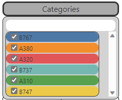
The options are divided into 5 areas, which are explained below.
Figure 12 - Categories
|
If the corresponding node is filled, the Categories area can be used to select and filter between the available elements. The individual elements can also be differentiated by color. In the upper area, a corresponding entry can also be found quickly using the search function. |
Figure 13 - Layout
|
Scale factor •The size of the display can be adjusted here in the levels XXS, XS, S, M, L and XL. Angle •The display angle of the diagram can be changed here by specifying a degree. Precision •The number of decimal places can be specified here, i.e. how numerical values are to be rounded for the display. |
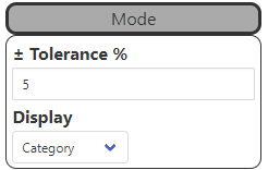
Figure 14 - Mode
|
Tolerance •The Tolerance button can be used to set the deviation of the performance measure. •This determines the percentage by which the actual value may deviate from the target value in order to mark the current as "suitable" (display setting: performance) Display •The coloring of the edges can be adjusted via Performance/Category. oPerformance: Color highlighting of connections that either fall within the defined tolerance range or exceed it. oCategory: Color highlighting of the connections, based on the values in the Category node |
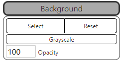
Figure 15 - Background
|
Background •A background graphic for the diagram can be inserted and parametrized here |
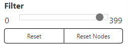
Figure 16 - Filter and reset |
Filter •The slider can be used to set a filter that relates to the columns in the ACTUAL value node Reset •Click on the Reset button to undo changes to the zoom settings and to move the entire diagram. Reset nodes •Clicking on the Reset node button cancels changes to the zoom settings and the moving of individual nodes. |

Connections ("links") between two nodes can be edited by double-clicking.

Figure 17 - Link editor
A new node can be added by clicking on the link and then moved to any position using Drag&Drop. In this way, links can be realigned as required.
Right-click on a node to remove it.
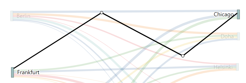
Figure 18 - New nodes
To exit the link editor, simply press the ESC key.
The key combination SHIFT + click can be used to switch back and forth between the different views/variants of a link.
This key combination also works without previously adding new nodes to the link.

Figure 19 - New link
4. Sample calculation for Desired-Value
The following data was used to create the chart and distributed to the nodes:
Figure 14 - Source table |
Figure 15 - Column distribution |

By clicking on OK or Apply, the calculation is started and the following SQL statement is generated in the background. All rows are grouped by start and end point and divided into categories:
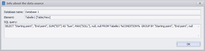
Figure 13 - SQL Statement of the Calculation
After the calculation is finished, the used data table looks like this

Figure 14 - Calculated data table

Figure 15 - Graphical evaluation
© SimPlan AG - Hanau District Court, Commercial Register (Part B) 6845 - info@simplan.de - www.simplan.de/en