The Chart type Chord displays data in a clear chord chart.
Contents
Chord Chart makes it possible to quickly identify relationships between different datasets, and more specifically, visualizes the connections between datasets.
But not only the connections are visualized, by another level of presentation it is possible to clarify their weightings.
Figure 1 shows a chord chart generated by SimVis. Clearly visible are the different records, separated by different colors, where connections exist.
In addition, it becomes clear that the individual areas have different sizes and thus visualize the weighting of the underlying data sets.
For more detailed instructions on interpreting the presentation, see Visualization interpretation in this chapter.
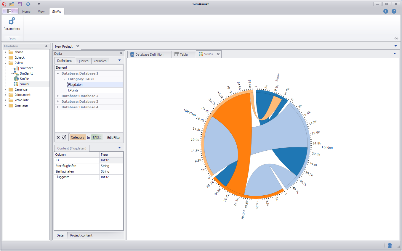
Figure 1 - Chord Chart
The important thing is how you distribute the individual columns of your data source to the different nodes - this directly influences the visualization. There are three different nodes available:
•Start: The Start area picks up the values from which connections originate.
•End: The End area indicates the values to which the connections lead.
•Value: The Value area is responsible for the weighting, ie. the numeric values of the column in the Wert area determine the dimension of the associated connection
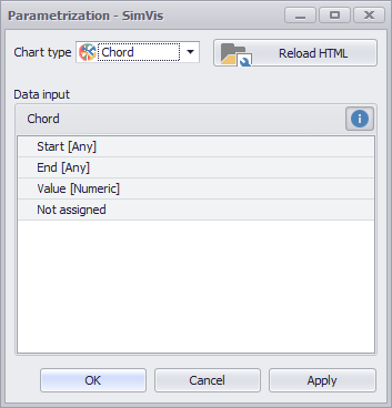
Figure 2 - Nodes Chord
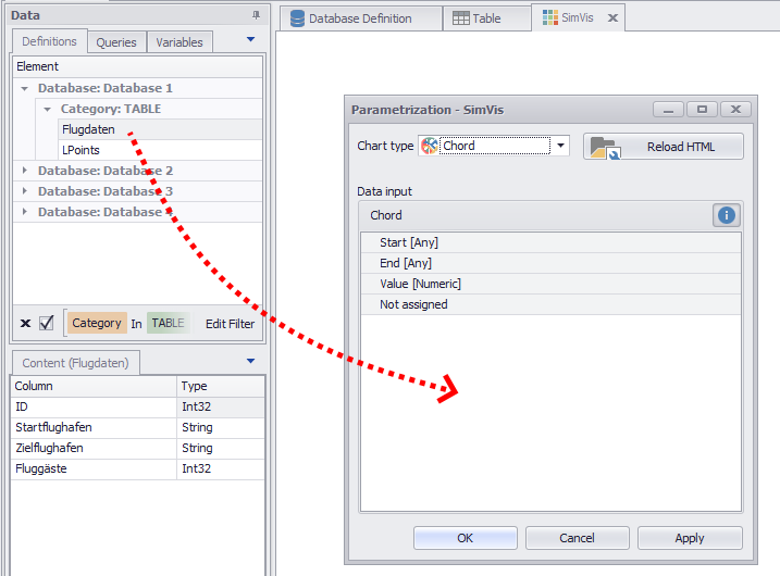
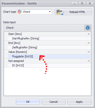
As soon as you have distributed the columns to the different nodes, you can create the diagram by clicking on OK or Apply.
Figure 3 - Adding data |
Figure 4 - Distribute columns |
In order to be able to interpret the visualization correctly, it is first of all important to understand the corresponding information that the representation provides.
The following figure shows a visualization, which is based on a fictional dataset with passenger data, with the help of which the interpretation should now be explained.
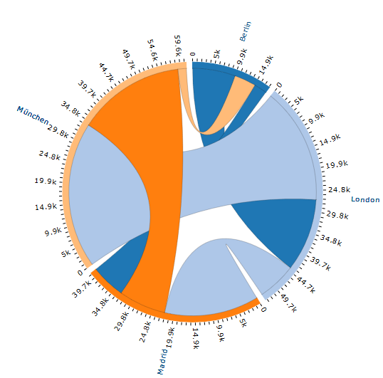
Figure 5 - Chord Chart visualization
This dataset contains flight connections to which each is indicated, from which airport you go out, which destination airport is headed and how many passengers are transported via this connection.
In tabular form, the data set just described can be seen in Figure 6. The three columns were distributed to the nodes as follows (see Figure 7).
Figure 6 - Chord Chart data |
Figure 7 - Chord Chart nodes |
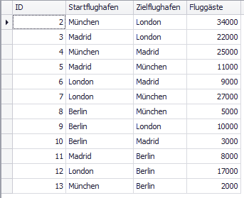
SimAssist linked the records using the Zielflughafen column because this column was assigned to the End node. Thus, the following relationship is shown by the visualization in Figure 8:
Figure 8 - SimVis Chord interpretation 1
|
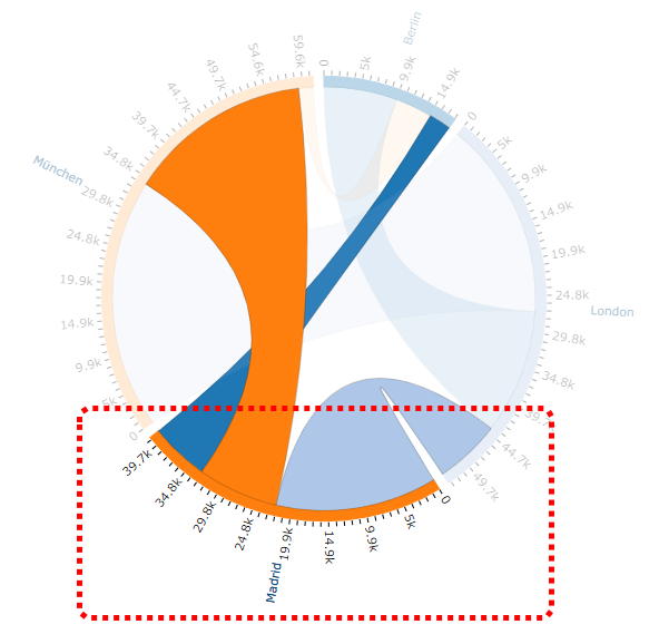
The individual colors represent the individual departure airports, for example, the starting airport Madrid marked on the adjacent figure is defined by an orange color.
The individual paths in different thicknesses and colors inside the circle symbolize the connections between the airports.
Accordingly, the designated departure airport Madrid has connections to the airports of Berlin, Munich and London.
Connections that are the same color as the departure airport itself are for outgoing connections, other colored paths are incoming connections.
Accordingly, Madrid has in this example an outgoing connection to Munich and two incoming connections from Berlin and London.
The thickness of the paths is directly related to the number of passengers of the respective connection.
Accordingly, it can be seen at a glance that significantly more passengers arrive from London than from Berlin in Madrid. |
Figure 9 - SimVis Chord interpretation 2
|
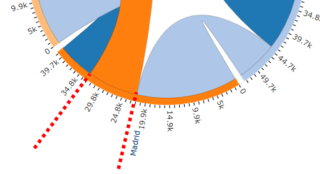
The number of corresponding passengers can be read off the scale assigned to each departure airport.
In the example opposite, the light blue incoming connection has approximately 22,000 passengers, while the outbound orange connection has around 11,000 passengers. |
Figure 10 - SimVis Chord interpretation 3 |
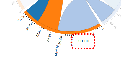
In order to know the total number of arriving and departing passengers, you can move the mouse pointer over the area of the desired departure airport (see adjacent figure).
In a popup window you will receive the expected information, in the current example, this would be 41,000 passengers. |
© SimPlan AG - Hanau District Court, Commercial Register (Part B) 6845 - info@simplan.de - www.simplan.de/en